
 Elena Garcia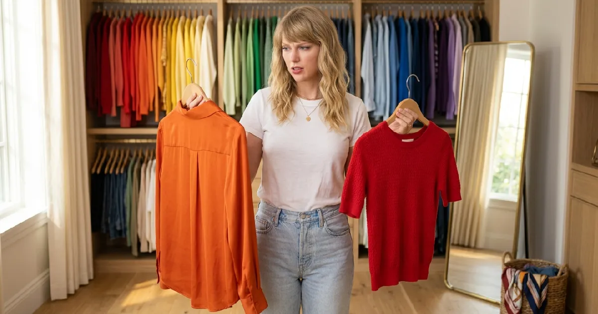
Key Points
- Certain two colors should not be worn together because they trigger visual tension in the brain, making you look disorganized before you say a word.
- The worst color combinations in fashion are not always obvious, and some of the most common pairings people wear daily are quietly working against them.
- Understanding basic color theory gives you a practical, repeatable system for building outfits that feel intentional and polished every single time.
Contents
Table of Contents
You Think You Know How to Get Dressed. Color Theory Says Otherwise.
You have done this a thousand times. You stand in front of your closet, pull on what feels right, and walk out the door convinced you look put-together. But somewhere between the mirror at home and the fluorescent lights at work, something feels off. You cannot name it. Nobody says anything. But you sense it.
That feeling is not paranoia.
Research in color psychology consistently shows that the human brain processes color combinations within milliseconds, forming impressions before logic has even caught up. According to a study published in the journal Color Research and Application, color harmony significantly impacts perceived attractiveness and social trust. In other words, your outfit is speaking before your mouth opens. The question is whether it is saying what you want it to say.
This is not about rigid fashion rules designed to make you feel small. This is about understanding why certain color pairings feel visually chaotic, so you can make informed choices rather than accidental ones.
Why Some Color Combinations Feel Wrong (And Why Your Brain Notices First)
Color is not just an aesthetic experience. It is a neurological one.
When your eyes take in two colors placed next to each other, your brain immediately evaluates whether those colors create harmony or conflict. This process is rooted in something called simultaneous contrast, a phenomenon discovered by French chemist Michel Eugène Chevreul in the 19th century. Simply put, colors influence how each other look. Place two clashing colors side by side, and they each appear more intense, more vibrant, and more visually aggressive than they would alone. The effect is well-documented in visual perception research.
Think of it like two people in a conversation who both talk at the same time. Neither message gets heard clearly.
Most people experiencing a wardrobe frustration do not realize this is happening at a physiological level. They assume they simply have bad taste or lack a natural eye for fashion. Neither is true. They just were never handed the map.
Here is that map.
The Color Pairs That Are Quietly Betraying Your Outfits
1. Brown and Black: The Combination That Confuses the Eye
This is perhaps the most universally worn clashing pair, and it is the one most people defend hardest.
Brown and black both read as neutrals, so pairing them seems logical. But here is the problem: they are neutrals that compete for dominance. Black reads as high contrast and sharp. Brown reads as warm and earthy. Together, they do not complement each other. They undercut each other. Your outfit ends up looking like a mistake rather than a choice.
This does not mean you can never mix them. The key is intentionality. A rich chocolate brown with a deep charcoal (which reads near-black) can work because the tones are close enough in temperature to create coherence. But a warm caramel with a cool jet black? That pairing will always look like you got dressed in the dark.
One place to start is asking yourself: Are both colors in my outfit warm-toned, or cool-toned? Mixing across temperature is where most casual color clashes begin.
2. Red and Orange: When Warmth Becomes Visual Noise
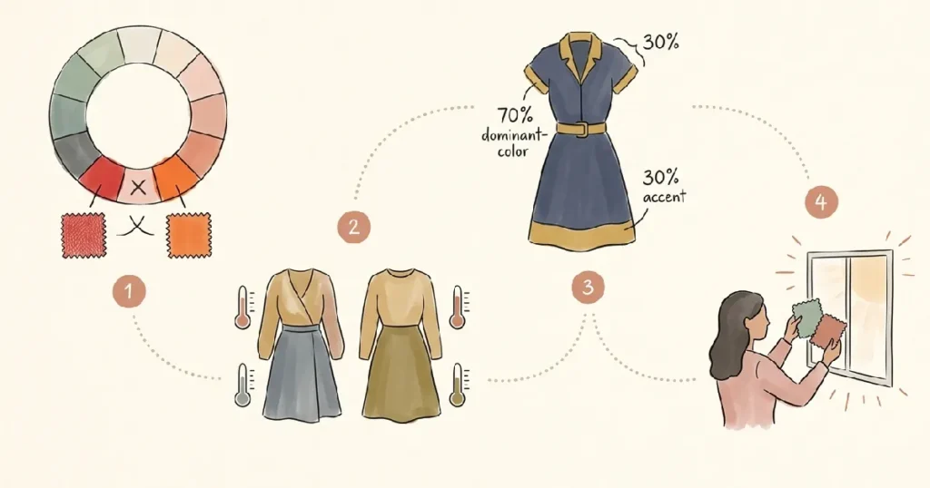
Red and orange are analogous colors, meaning they sit next to each other on the color wheel. Understanding color wheel relationships is foundational to understanding why some pairings feel harmonious and others do not.
Here is the bizarre truth about these two: because they are so similar, they do not create interesting contrast. They just compete. Wearing red and orange together is like turning the volume all the way up on two different songs at the same time. Technically both are music. Together, they are just loud.
This pairing works only when there is a dramatic difference in tone or saturation. A deep burgundy with a muted terra cotta, for example, can feel sophisticated because the tones are far enough apart to create a relationship rather than a rivalry.
But a bright cherry red with a vivid orange? That is the outfit equivalent of shouting.
3. Navy Blue and Black: The Low-Contrast Trap
This one surprises people because both colors feel classic. Both feel polished on their own. But placed together, navy and black create a low-contrast muddle that reads less as a deliberate pairing and more as a laundry sorting error.
The issue here is not clash. It is the opposite. They are too similar in depth to create any visual interest, but different enough in undertone that the combination looks accidental rather than intentional.
I have seen this combination more times than I can count in professional settings, and the consistent feedback from people who wear it is that they feel somehow less polished than usual, without understanding why.
But here is what no one tells you.
The brain actually reads low-contrast mistakes as lack of attention to detail. And in social and professional contexts, attention to detail matters more than most people acknowledge.
If you love both navy and black (and who does not?), the solution is simple: wear one as the dominant color and use the other as a deliberate accent in something small, like a belt, shoes, or bag. Never give them equal weight.
4. Green and Purple: The Accidental Halloween Palette
Green and purple are not inherently wrong. In fact, in certain saturations, this pairing can feel genuinely artistic. But at full saturation, bright green and vivid purple together read as a costume rather than a coordinated outfit.
This is because both colors have strong cultural and visual associations, and when placed together at high intensity, they overwhelm the eye rather than directing it.
The fix is tonal calibration. A sage green with a dusty mauve? That is a beautiful, sophisticated pairing. A lime green with a royal purple? You are going to a theme party, whether you meant to or not.
5. Pink and Red: The Combination That Only Works Under Specific Rules
This pairing became a fashion moment thanks to a push against conventional rules, and in certain contexts, it genuinely works. But for most people, most of the time, wearing a warm bubblegum pink alongside a true red creates the same analogous-color tension as red and orange.
Color psychology research from the University of Rochester suggests that red carries inherently strong psychological signals tied to attention and urgency. Pairing it with another warm, bright color dilutes that signal and creates visual competition.
Pink and red can coexist beautifully when the pink leans cool (think dusty rose or blush) and the red is deep or muted (think wine or cranberry). The key is temperature alignment, not avoidance.
The One Color Mistake Almost Nobody Talks About (The Insight Most People Miss)

Most color advice focuses on hue, meaning the actual color name. Red, blue, green. But the real culprit behind the worst outfits is almost never the hue. It is the undertone.
Every color has an undertone: warm (yellow or orange based) or cool (blue or pink based). When you put a warm-toned version of one color next to a cool-toned version of another, the result always looks slightly wrong, even if you cannot name the reason.
Think of undertone as the personality beneath the color. Two people can both be wearing beige, but if one is wearing a warm, golden beige and the other is in a cool, greige (gray-beige), they will visually clash even though they appear to be in the same color family.
This is the single most common reason people feel like they cannot figure out color combinations. They are looking at the color. They should be looking at the temperature.
How to Build a Color Confidence System That Works Every Time
The Three-Second Temperature Test
Before you finalize any outfit, hold both pieces next to each other in natural light. Ask yourself: Does one feel warmer than the other? If yes, and if both colors are vivid or deeply saturated, that pairing likely needs an adjustment.
This does not require formal training. It requires one habit practiced a few times until it becomes automatic.
The Neutral Anchor Strategy
When in doubt, anchor your outfit in one true neutral (white, gray, camel, or ivory) and build from there. Neutrals do not compete. They create space for the other colors to breathe.
Consider how this might work in practice. Maya, a graphic designer who loved bold color, came to realize that every outfit she loved in her closet had at least one neutral piece. Her favorite looks were not colorless. They were anchored. The neutral gave the other colors somewhere to land.
The Dominant-Accent Rule
Choose one color to carry 70% of the outfit. Let the second color appear in 30%. Never split equally. An outfit divided equally between two competing colors becomes a visual argument. Give one color the floor, and let the second one respond.
The Tone Alignment Check
Before buying or wearing any two-color combination, ask: Are both colors speaking the same temperature language? Warm with warm. Cool with cool. Mixing temperature is the single most reliable predictor of a color pairing that simply does not work.
You Already Have Better Taste Than You Think
Here is the reframe worth holding onto.
If you have ever looked at an outfit and felt something was wrong without being able to name it, that is not a lack of style sense. That is actually your color perception working correctly. Your brain was detecting the tension. You just did not have the language to describe it.
Now you do.
Understanding what two colors should not be worn together is not about memorizing a list of forbidden pairs. It is about understanding the logic underneath the feeling, so that your instincts and your knowledge work together instead of leaving you confused in front of a mirror.
Clothing is one of the few creative decisions you make every single day. You deserve to make it with intention.
The next time something feels off, trust that feeling. Then use the temperature test to find out why.
Your closet has not been failing you. You just needed a better lens.
My Closing Remarks
Here is something I rarely say out loud: I spent an embarrassing stretch of my adult life defending my brown-and-black outfits like they were a personal philosophy. I was wrong, and looking back at photos from that era confirms it in the most humbling way. The truth about color clashes is that nobody wants to tell you. Friends do not say it. Colleagues glance and move on. But the impact is real, and it is daily. You are walking into every room in an outfit that either builds your credibility quietly or undermines it quietly. Once you understand that, you cannot un-see it. And that knowledge changes everything.
More Related Stories for You
- If this sparked something for you, you might also enjoy learning about the 3-3-3 rule for men’s style or finding a cute outfit for Thanksgiving that gets the color balance exactly right.
About The Author